The Standardized Work Chart: The Final Form, Not the Starting Point
The Standardized Work Chart is the visible workplace standard condition, but it should be the final form after analysis, not the starting point.
This is article 6 of 10 in a series on Toyota Standardized Work.
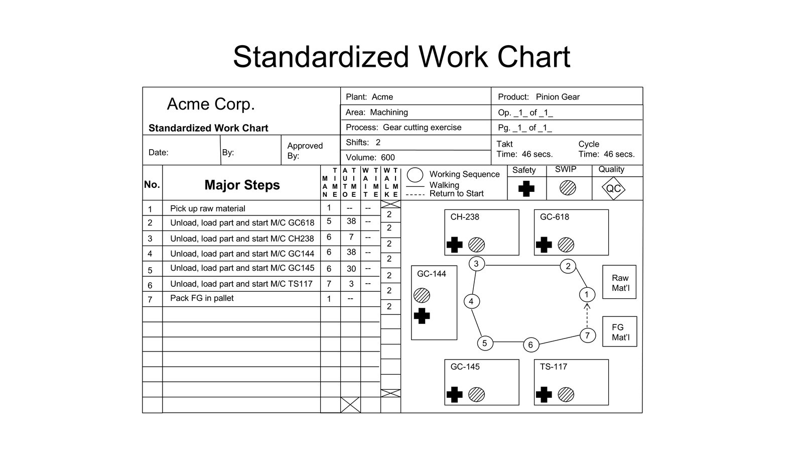
The Standardized Work Chart is the sheet most people associate with Toyota Standardized Work.
It is usually the one posted at the job. It has the layout. It shows the work sequence. It shows walking lines, return paths, standard work-in-process, safety points, quality points, takt time, and cycle time. It looks official. It looks like the standard.
That visibility is useful.
It is also dangerous.
Because the chart is the most visible form, many companies start there. They draw the layout, number the steps, add a few symbols, and call the result standardized work. Sometimes the chart is accurate enough as a picture. But it may not rest on process capacity analysis. It may not reflect a real combination of human and machine time. It may not connect to Job Instruction. It may not expose problems. It may or may not be used for kaizen. Often it is part of a regulatory and audit system.
Then the chart becomes Lean Wallpaper.
The Toyota Standardized Work Chart is important, but it is the final form in the three-form logic, not the starting point.
What the Chart Is Supposed to Show
A good Standardized Work Chart shows the current workplace standard condition.
It typically includes:
- the physical layout,
- the operator’s work sequence,
- walking path,
- return path,
- standard work-in-process,
- safety points,
- quality points,
- takt time,
- cycle time,
- basic job and area information.
Those items are not random.
The layout matters because motion is physical. The sequence matters because the operator’s repeated cycle must be clear. Walking matters because it consumes time and affects the work combination. The return path matters because the cycle has to repeat. Standard work-in-process matters because the sequence often cannot function with zero material everywhere. Safety and quality points matter because the best sequence is not only the fastest sequence. Takt matters because the work must connect to demand. Cycle time matters because the current method must be compared to the required rhythm.
The chart is a compact picture of the current method.
But it is not the whole method of developing that method.
The Chart Depends on the Prior Analysis
The Process Capacity Sheet asks what the process can actually do.
The Standardized Work Combination Table asks how manual work, automatic machine time, walking, waiting, and takt fit together.
The Standardized Work Chart then shows the workplace arrangement and sequence that result.
That order matters.
If the Process Capacity Sheet was not done, the chart may show a sequence for a process that cannot meet the required rate. If the Combination Table was not done, the chart may show a walking path and step order without understanding the timing relationship. If Work Standards are weak, the chart may assume quality, tooling, machine condition, or maintenance capability that does not actually exist.
The chart should be the visible answer to prior questions.
When people start with it, they often use it as a prettier SOP.
Toyota used it as a workplace expression of a studied standard condition.
Sequence Is Not Merely Step Order
The work sequence on a Standardized Work Chart is more than a list of tasks.
In Toyota Standardized Work, sequence means the order in which the operator performs the work to complete one cycle under the current standard condition. That sequence must fit the physical layout, the work combination, the required quality and safety points, and takt time.
This is especially important when the operator handles multiple machines or processes. The sequence may not be the same as the part’s process flow. It may be determined by machine completion timing, walking, manual load/unload work, inspection points, and the need to return at the right moment.
The chart should make that operator sequence visible.
If the chart merely labels machines one through five in process order, but the operator actually works them in a different order because of timing, the chart is not doing its job.
A good chart helps a supervisor see the intended cycle and recognize abnormality. Is the operator following standardized work or is there an abnormal condition lurking?
Is the operator following the sequence? Is the path being interrupted? Is a quality check skipped? Is standard work-in-process in the wrong location? Is the machine cycle lagging? Is the operator waiting somewhere not shown on the chart? Is extra walking occurring because material is not in the standard location?
The chart should make those questions easier.
Standard Work-in-Process Is Not Random Inventory
One of the most misunderstood parts of the chart is standard work-in-process, often abbreviated SWIP.
SWIP is not simply any inventory near the process. It is the minimum necessary work-in-process required to allow the standard sequence to function.
That distinction matters.
Some processes need a piece in a machine while another piece is being handled. Some need one piece positioned at a check point. Some need material at a specific handoff point so the cycle can repeat without interruption. In certain machine processes, SWIP may be necessary because the machine is working automatically while the operator is elsewhere.
But extra inventory beyond the necessary standard condition is not SWIP just because it is near the job. It is inventory. It may hide problems. It may disconnect the process from takt. It may allow overproduction.
The chart should show the standard material condition clearly enough that abnormality can be seen.
If the chart shows one piece and there are five, why? If the chart shows SWIP at a machine and the part is missing, why? If the operator keeps adding extra parts to protect against timing problems, what is the real issue?
Standard work-in-process is one of the ways the chart connects sequence, flow, and problem visibility.
Safety and Quality Are Built Into the Standard Condition
The chart is not only a productivity device.
Safety and quality points belong on the chart because the current best method must include them. A faster sequence that creates unsafe motion or weak quality confirmation is not the best method. Toyota also has quality check forms and safety documents we will discuss in another section. These are noted in Standardized Work but not considered the source documentation.
This is another reason Standardized Work should not be treated as an isolated form. The safety and quality points on the chart should connect to deeper standards and knowledge: quality standards, inspection methods, gauges, tooling conditions, machine settings, ergonomic risks, maintenance standards, and Job Instruction key points. Russ Scaffede, a retired VP of Toyota Powertrain Operations, makes another important point. You don’t want to run the risk of putting your safety and quality key points entirely in a Standardized Work Chart. What happens when you ask a Team Member to eliminate waste and improve the process? A well-intended person could eliminate a check to save time. On paper that is a fake kaizen. In reality it becomes a huge potential liability.
The chart can point to a quality check. It does not contain the entire quality standard.
The chart can mark a safety point. It does not replace safety analysis or safe work training.
The chart can support teaching. It does not replace the Job Breakdown Sheet, key points, reasons why, practice, correction, and confirmation.
This is where many companies overload the chart. They want one sheet to be the SOP, the training document, the quality standard, the safety standard, the audit checklist, and the kaizen plan. I have actually heard lean consultants parrot this line before. “The Standardized Work Chart should contain all necessary information to do the job. You should be able to look at the form and know how to do the job.” At best that is a Swiss Army knife style of consulting and documentation, trying to make one document do everything. I have never seen it work in real life. And I can factually point out it never functioned this way inside of Toyota.
Toyota had different documents for different purposes.
The Standardized Work Chart is powerful because it is specific, not because it does everything.
The Chart as an Observation Tool
A posted Standardized Work Chart should help leaders observe work.
It gives a basis for comparison between the standard condition and actual condition. That comparison is not supposed to be a policing ritual. It is a way to see problems.
If the operator cannot follow the sequence, why not?
If the cycle exceeds takt, why?
If the return path is different, why?
If standard work-in-process is not maintained, why?
If a safety or quality point is skipped, is the issue training, method, workload, layout, part presentation, tool condition, or something else?
If the chart has not changed for months while demand, staffing, layout, or product mix changed, is it still the standard condition?
These questions are the difference between Standardized Work and compliance paperwork.
The chart should help reveal abnormality. It should help the team leader or supervisor coach and improve. It should create a shared reference for kaizen.
If nobody uses the chart to observe, teach, or improve, the chart has lost most of its function.
The Chart Changes When the Work Changes
Another weakness in many companies is treating the chart as a permanent document.
Toyota did not view Standardized Work that way. Standardized Work reflects the best current method under current conditions. When takt changes, allowed labor changes, layout changes, machine conditions change, product requirements change, or kaizen changes the work, the standard should be reviewed.
This does not mean standards are casual. It means they are living control points.
A stable standard makes change possible because it defines the current condition. A changed condition requires the standard to be updated, taught, and followed again. Without that discipline, kaizen becomes temporary. The old method returns. Or worse, several unofficial methods coexist and nobody knows which condition is being improved.
The chart is therefore part of the PDCA loop.
Plan the method based on takt, capacity, work combination, safety, quality, and flow. Do the work according to the standard. Check the actual condition against the chart. Act through correction, teaching, or kaizen. Then update the standard when the method changes.
That is much different from annual document review.
Why the Chart Is Easy to Copy and Hard to Use
The Standardized Work Chart is visually simple. That is one reason it spread.
A company can make a template in an afternoon. It can train people to draw a layout. It can require charts to be posted at every cell. It can audit whether the charts exist.
But using the chart well requires more capability.
Someone must understand takt. Someone must know the process capacity. Someone must observe the combination of human and machine time. Someone must distinguish Work Standards from Standardized Work. Someone must teach the job through Job Instruction or equivalent capability. Someone must know how to see abnormality. Someone must connect the chart to kaizen. Someone must update the chart when the work changes.
That is why the chart alone often disappoints.
The visible document was never the whole Toyota mechanism.
A Final Form With a Practical Purpose
Calling the Standardized Work Chart the final form does not make it unimportant.
It is important precisely because it puts the standard condition at the workplace. It lets people see the intended sequence, path, SWIP, quality points, safety points, takt, and cycle. It gives supervisors and team leaders a basis for observation. It helps operators and trainers share a common reference. It supports kaizen by making the current condition explicit.
But it only has that power when it rests on the right foundation.
The Process Capacity Sheet tells us whether the process can support the required rate.
The Standardized Work Combination Table tells us how human work, machine time, walking, waiting, and takt fit together.
The Standardized Work Chart shows the current workplace method that results.
That is why starting with the chart is risky.
You may get the picture without the thinking.
Toyota Standardized Work was not created to make better wall charts. It was created to make real work visible, teachable, repeatable, observable, and improvable in relation to demand.
The chart is the final visible expression of that logic.
Treat it that way, and it becomes useful.
Treat it as the whole system, and it becomes wallpaper.
Series navigation: Previous: The Standardized Work Combination Table: Seeing Human and Machine Time Together | Next: Work Standards Come Before Standardized Work